Case study: IA&UX for multi-touch content
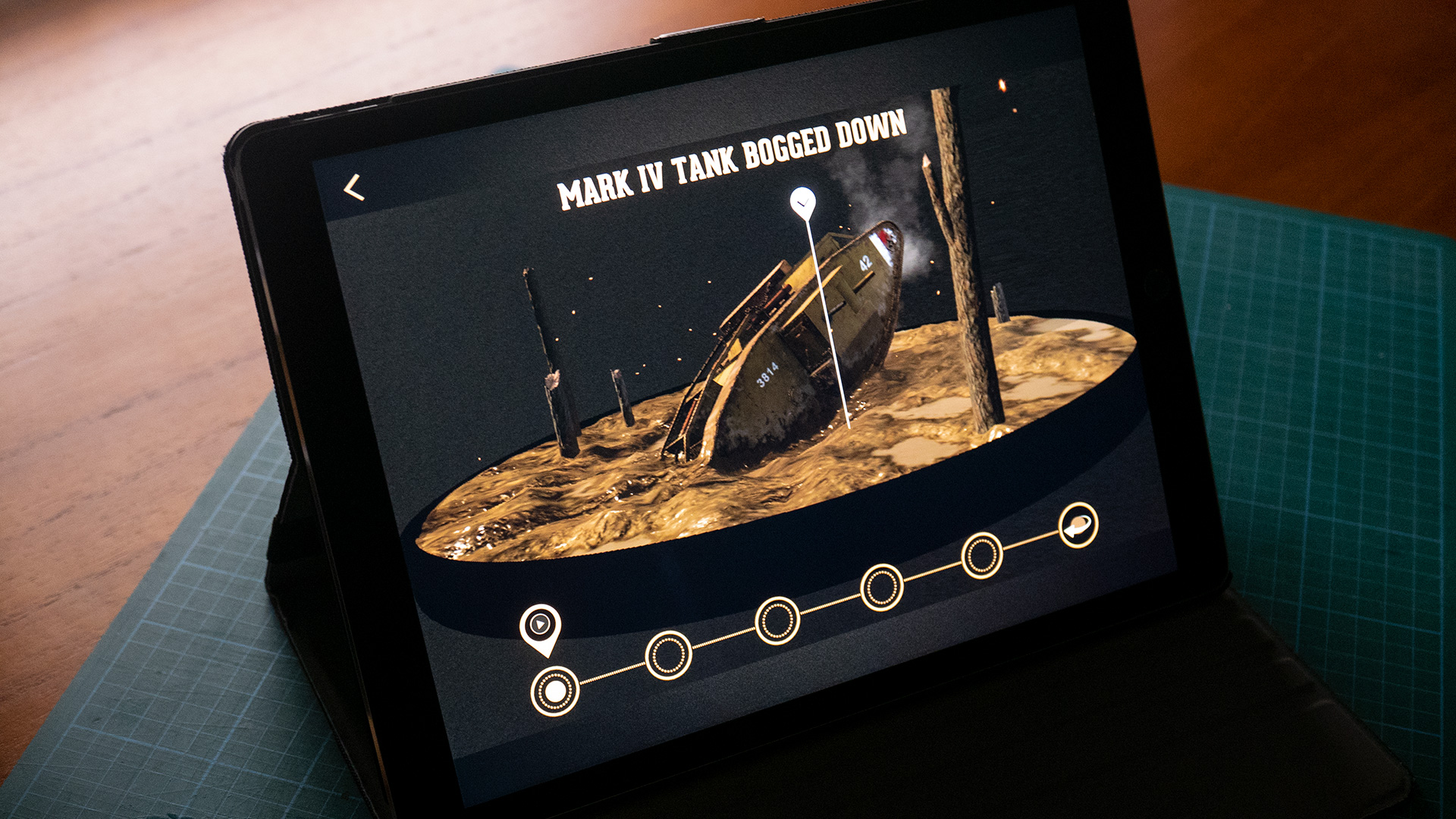
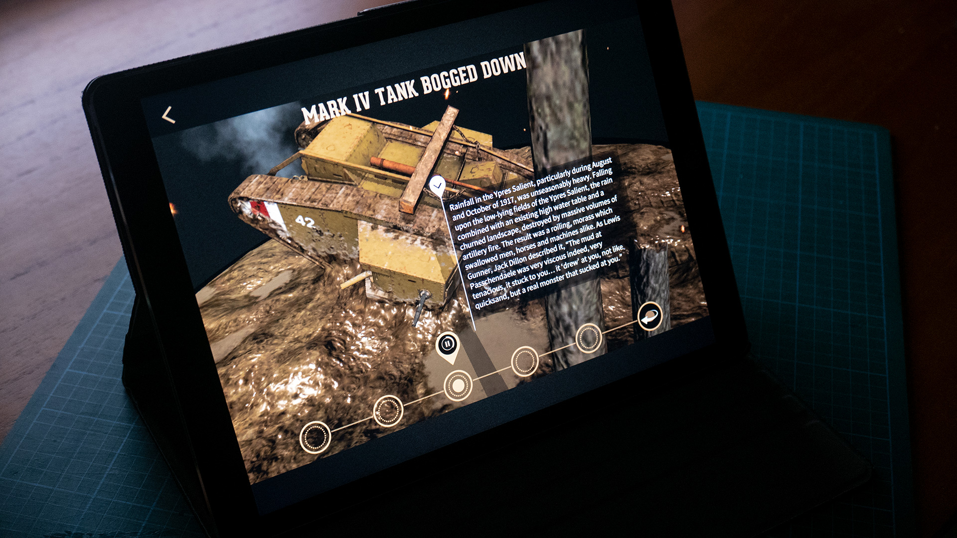
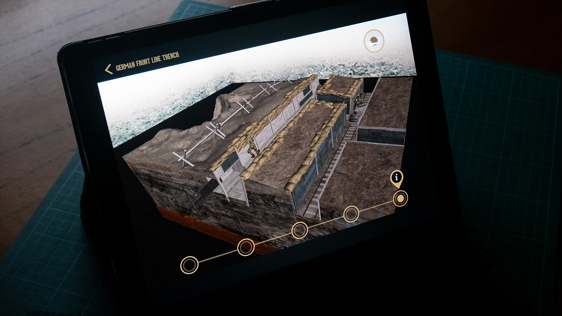
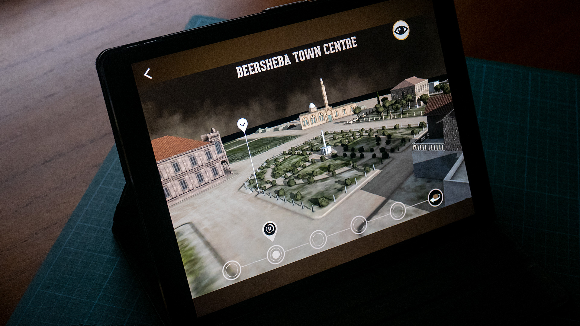
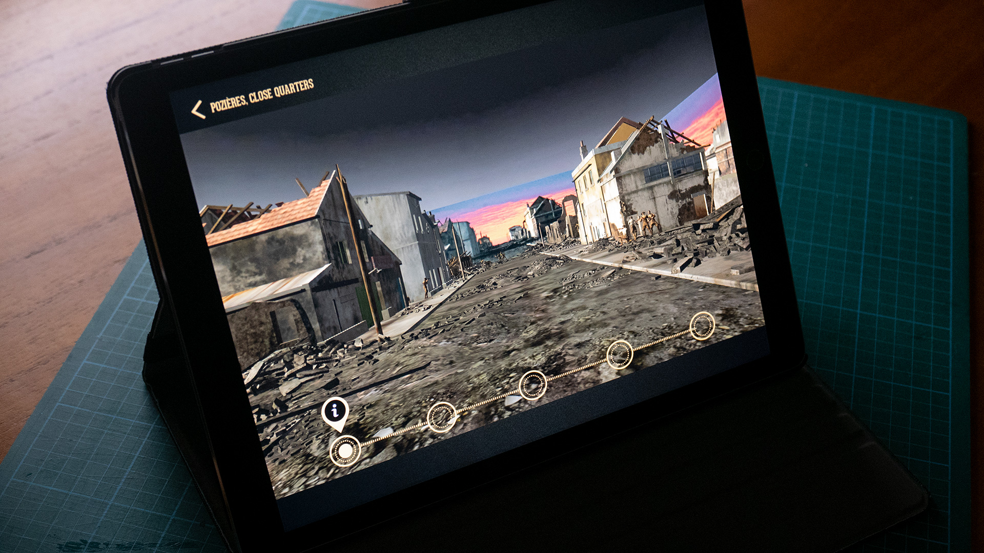
In producing the Days in Conflict series of apps, we created a series of interactive dioramas which allows users to study in detail objects of war, from tanks to pillboxes as well as more complex scenarios, such the geography of a town.
The first step in producing these interactive modes is visualising what you hope they’ll look like, as below, and then creating a UX flow for achieving this.
In this initial visualisation. the basic information of the mode is presented. It will then be detailed in the accompanying UX documentation.
The finished scene consists of a pre-prepared set of 3D models, including a turntable base and the subjects of the diorama, and a set of 2D interface elements that allows users to track their interaction.
The 3D model elements are re-topologised (polygon reduced) for optimised presentation on a range of tablets and imported into Unity, the development environment for the finished app, to be paired with the 2D interface elements, sound assets and object/camera functionality.
Below, pages from the UX doc describe various functions of the interactive design. These are used in conjunction with storyboards, as shown above, and design/content assets to create the finished diorama environments in a Unity scene, which is then staged within the rest of the app framework. Click images to enlarge:
Template development
Once the 2&3D elements have been paired together, final touches in terms of lighting, adjustments to bump and specular highlights, particle systems for dust and embers are added. This is balanced against what the graphics processing on the more modest tablets in the range targeted for the app can manage. (The range of tablets include iOS and Android devices, including iPad2 at the low end).
Below are dioramas from across the series: